
AI cracked YouTube thumbnails for my 500-sub channel
How I redid every thumbnail on my 500-sub channel with AI: the rules, the real prompts, before and after examples, and guidelines you can paste into your own agent.
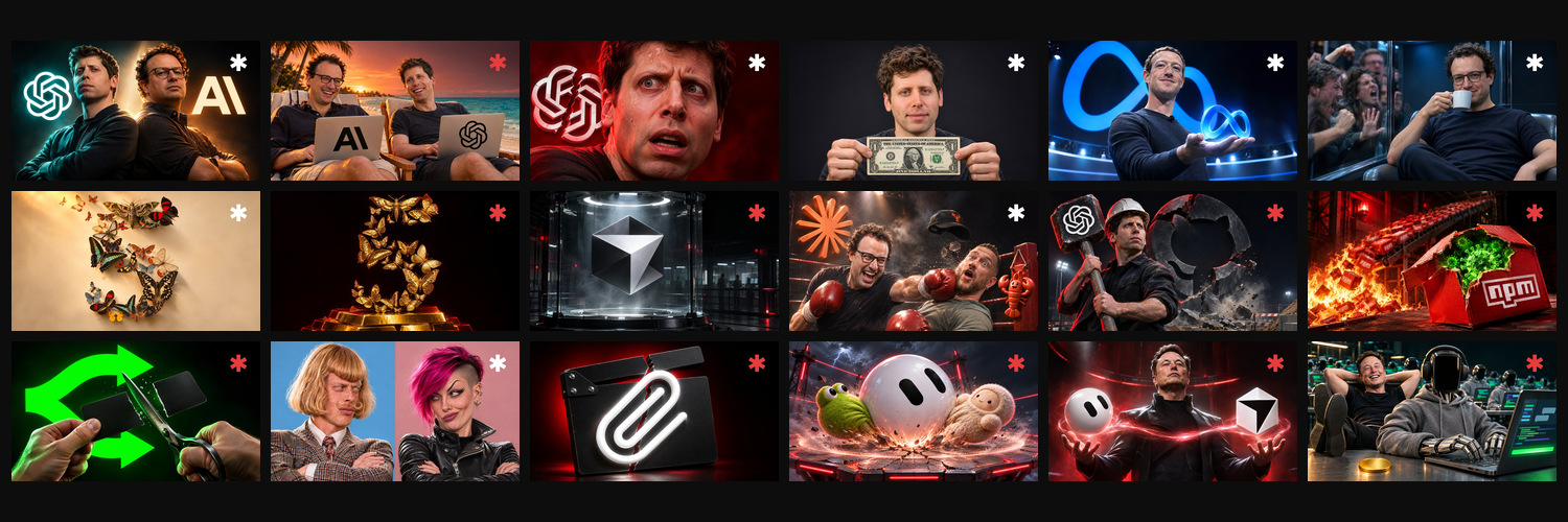
Read the guide, then turn it into a concrete plan for your brand.
I have a YouTube channel called Ship Sh*t Show. I talk about AI with my friend Mitchell, every week, live.
Nobody is watching it while we're live. I don't care. I'm catching up with my friend, and the recording becomes the video.
But the thumbnail is the one thing that still decides whether a stranger ever clicks. So I spent a few hours redoing all of them, talking with Claude: building the skills, the taste and the process, so every weekly video now gets its thumbnail generated automatically. This is what I learned, the exact rules I ended up with, the prompts I actually used, and a block of guidelines you can paste straight into your own agent.
I wrote this from the same Claude session I did the work in, so everything below is what actually happened, including the parts that went wrong.
Half the internet is already written by AI
Graphite looked at 65,000 English articles from Common Crawl. In late 2024 AI-written articles caught up with human ones, and by May 2025 they were about 52% of new articles. They re-ran it this year: 50.9% in Q4 2025, 49.9% in Q1 2026. So it isn't still climbing. It has settled at about half. (Graphite, Axios)
That's articles, and it's measured with AI detectors, so take the exact number loosely. But the direction is obvious, and thumbnails are going the same way.
The other number in that study is the one I care about: most of the articles that actually rank in Google were still written by people. Volume is cheap now. Standing out isn't.
So "made with AI" is not a selling point, and it's not a scandal either. It's the default. The only question left is whether the thing is good, and whether it looks like everybody else's.
You are not famous enough to ONLY use your face
A face on a thumbnail works when people already know the face. MrBeast's face is a brand. Mine is a stranger's face with a "who is this guy" tax on it. Same for Mitchell.
So my first answer was to drop our faces completely. If a face carries the idea, it's someone viewers already recognise, as a stand-in for their company. Altman is OpenAI. Dario is Anthropic. Elon is xAI. Zuck is Meta. Peter Steinberger is OpenClaw.
Then I got feedback, and it was fair: a thumbnail with only Altman on it, for a video where two guys talk about Altman, is a bit deceptive. You click expecting him and you get us.
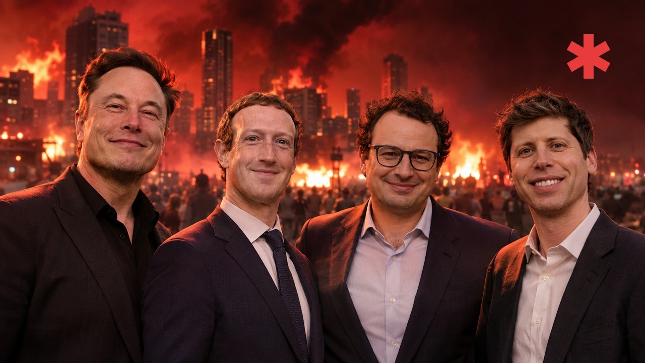
So now it's both. The famous face, or the logo, carries the topic and earns the click. Our faces tell you who you'll actually be watching. Neither one works alone at 500 subs. The "after" thumbnails below don't have us in them yet. The next round will.
Six fingers is not the problem anymore
A year ago every "bad AI thumbnail" video had the same list: extra fingers, melted text, waxy skin. That list is dead. The 2026 image models get hands, skin and lighting right, and they can spell.
What still gives an AI thumbnail away is sameness. Everyone prompts the same glossy look, the same glowing logo on a dark background, the same safe metaphor. vidIQ called this out early: AI thumbnail makers push every channel toward the same image, and sameness is the opposite of what a thumbnail is for. (vidIQ)
The second giveaway is a fake likeness. A face that looks like "a guy" instead of the actual person is worse than no face.
My rule: make a good thumbnail, and if AI makes it, nobody should be thinking about AI.
Before and after
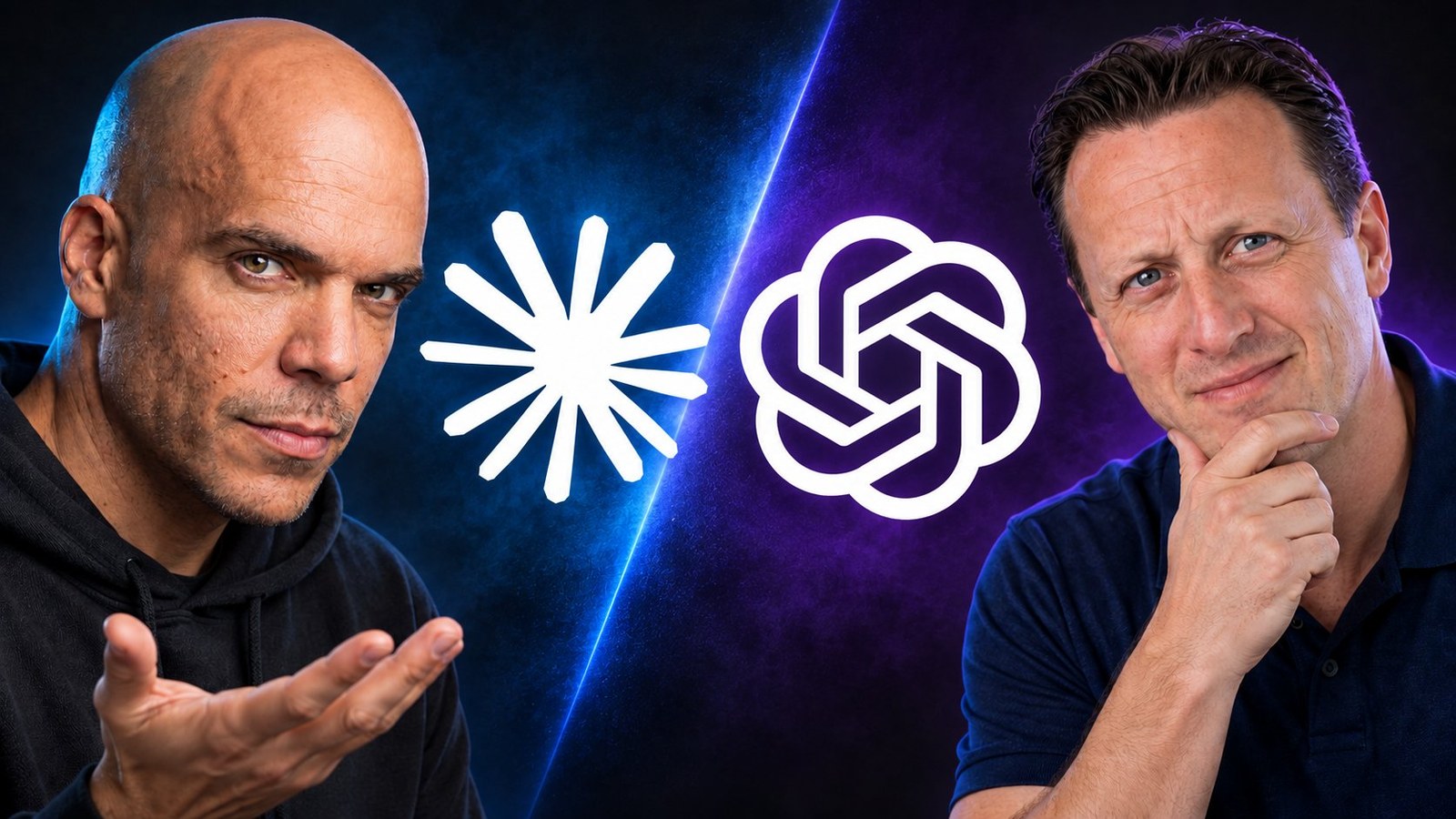
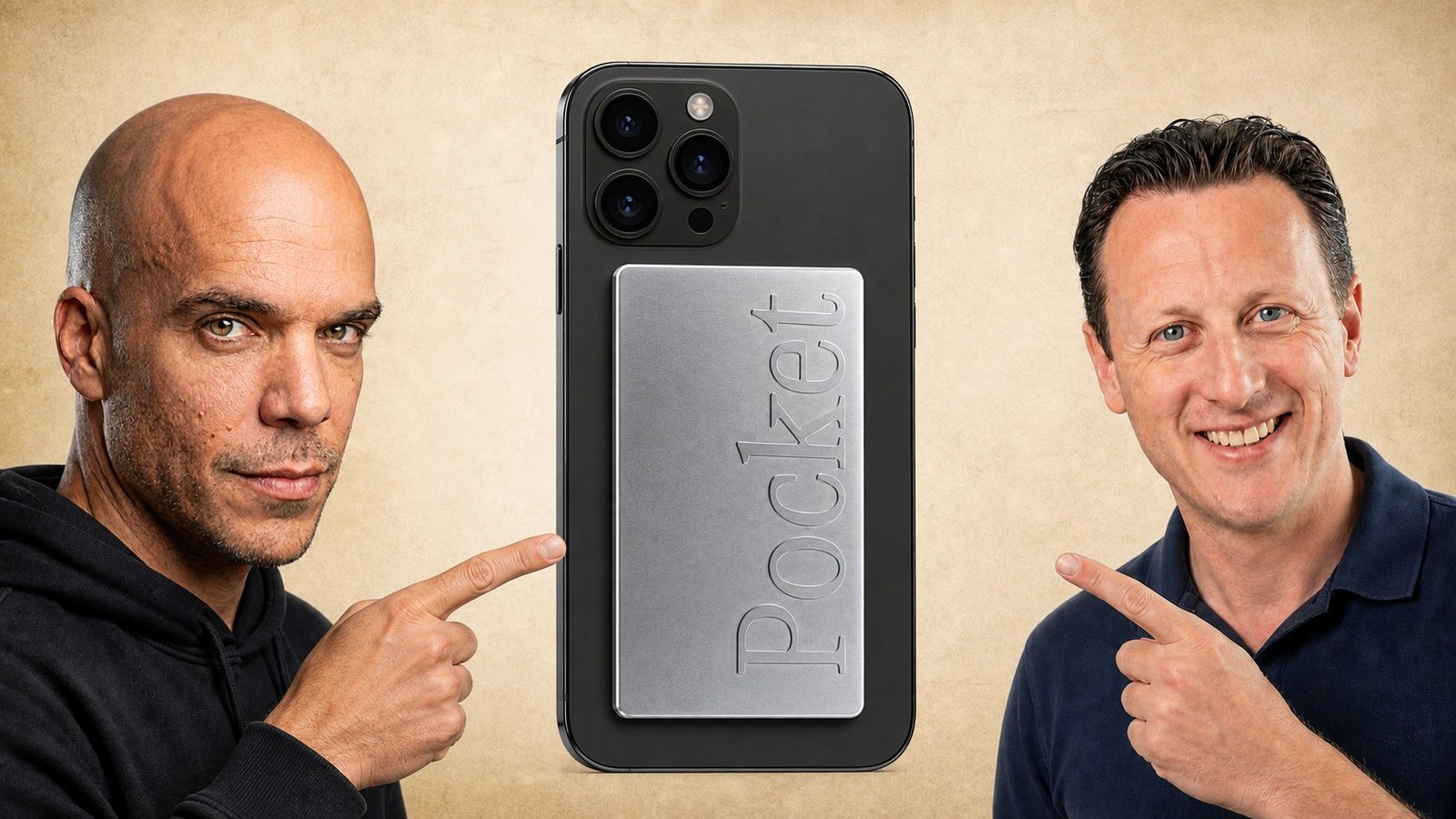
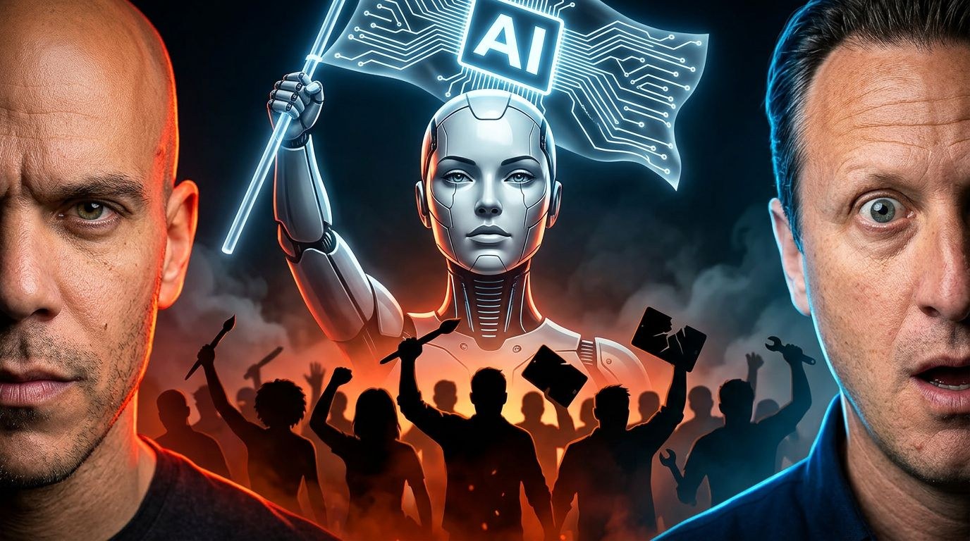
This is what the channel looked like before. Mitchell and me on every thumbnail, next to a logo or a generic AI picture. Nobody knows our faces, so they did nothing for the click, and the picture in the middle didn't tell you the story either.
Fable 5.1 vs GPT-6 Astra: Is It AGI? Before: the two of us on either side of two logos. After: Dario and Sam, face to face over their models.

HeyPocket: Turn Calls Into Support Tickets. Before: us pointing at a phone. After: the product doing the job, a call turning into tickets.

You Reject AI. It Doesn't Matter. Before: our worried faces around a robot waving an AI flag. After: the four AI CEOs smiling in front of a burning city.
The channel banner got the same review.
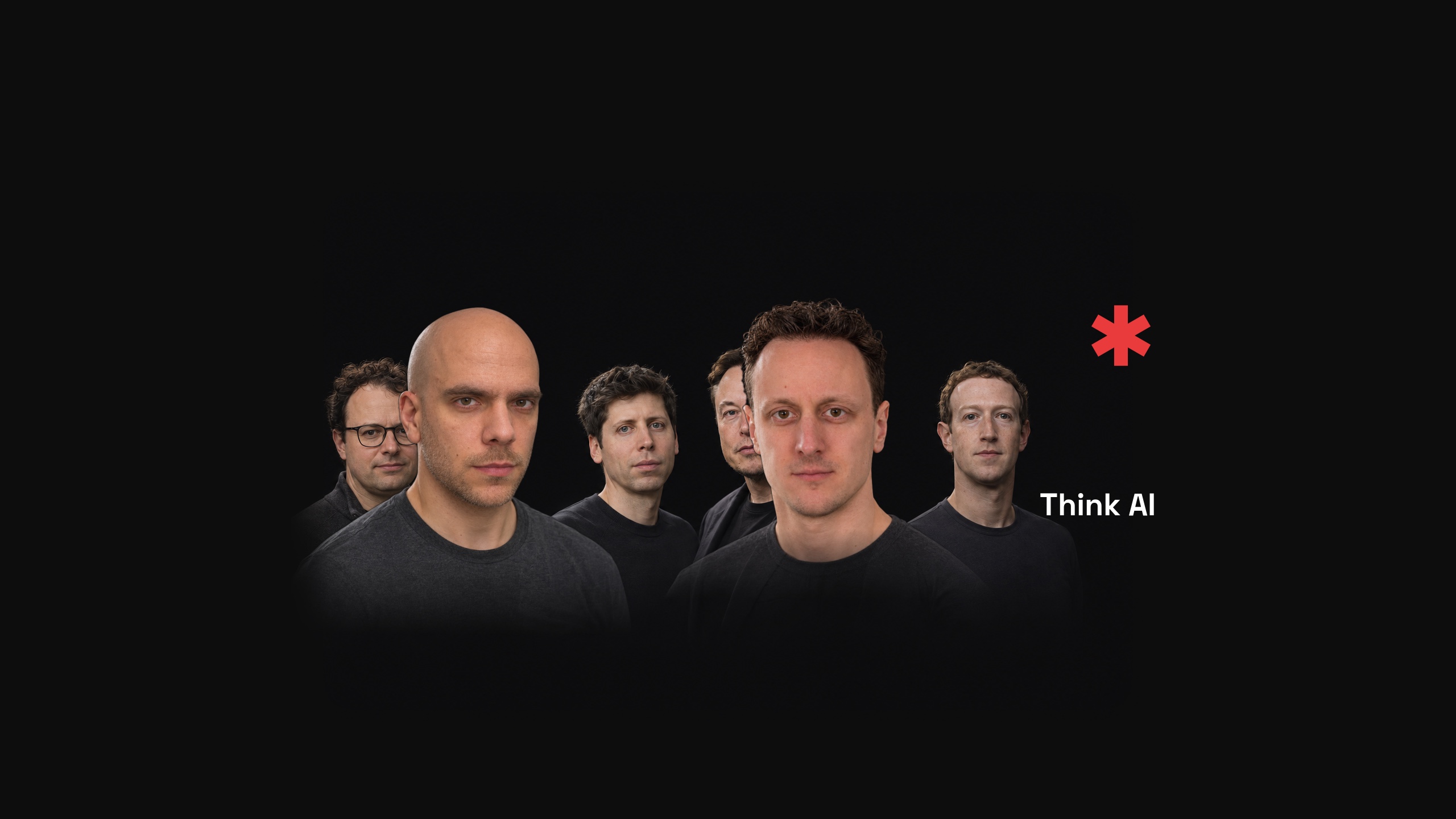
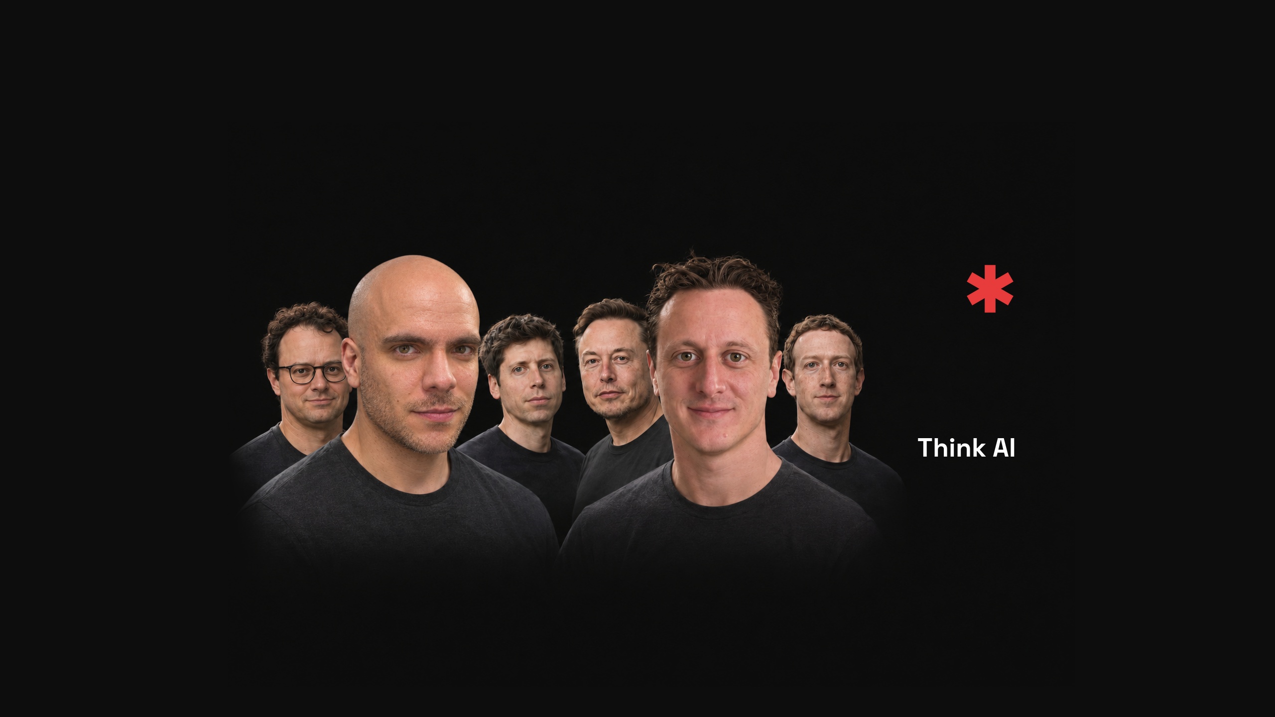
Same pattern every time: fewer things, one clear story, one feeling.
The rules we ended up with
These are written down in our brand repo and in the skills our agents use, so every new thumbnail follows them without me repeating myself.
- Photoreal. It should look like a photograph. Pop-art, clay, painted and paper-cut styles all lost.
- No text. The title already carries the words, and on a phone extra text is noise. The one exception is a single word I ask for on a prop in the scene, like FREE on a price tag.
- One idea. The viewer should guess the title from the image alone. Nothing else competing.
- Real logos. Pass the official logo file as a reference and tell the model to copy it exactly. Close enough isn't good enough for a brand mark.
- Famous faces from real reference photos, plus ours. The famous face carries the topic, ours set the right expectation for the click. Check every likeness against real photos before anyone looks at the result.
- A small asterisk, top-right. That's our mark. It's stamped on afterwards with a script, never generated.
- Different art for the video and the livestream. If both look the same, one of them is wasted.
The prompts we actually used
These are copied from the generation logs, not rewritten for the article. All of them ran through the Codex CLI's image tool.
What the winning prompts have in common:
- The real logo goes in as a file. Say "copied exactly", "never mirrored", and tell the model to ignore the logo file's background.
- Name the one hero and its size. "His face must be big and instantly recognizable at small size."
- When you iterate, attach the current image. Say what to keep and the one thing to change.
- Reserve the corner. "Leave the top-right corner empty." Our mark is stamped there later.
- State the text rule outright. "No text, no readable words." Or "FREE is the only text allowed".
A full prompt: Elon and his Grok butler. This concept made the approved list.
Create exactly ONE image: a 16:9 YouTube thumbnail, ideally 3840x2160, with the appearance of a real ultra-high-resolution 4K photograph. Full-frame camera, 35mm lens, sharp subject focus, true-to-life skin, leather, polished metal and white robot materials. Cinematic dramatic lighting, high contrast, vivid saturated lighting accents in a dark moody studio. No collage, no illustration, no cartoon, no plastic-looking CGI.

SCENE: Elon Musk in a black leather jacket stands proudly next to a sleek SMALL white butler robot assistant. Both face camera with a clear readable silhouette; Elon looks proud and confident. The small robot holds a real silver serving tray with a single plain closed envelope lying on it. No writing on envelope. One clear idea: Elon with his helpful Grok butler. No other people or clutter.

REFERENCE IMAGE 1 is a mandatory exact logo artwork source, NOT the composition to reproduce. Use the supplied white Grok symbol with its exact circle and diagonal slash geometry, copying the reference artwork exactly and unaltered: no redesign, no substitute, no lettering, do not simplify into a generic slashed circle. Integrate that SAME artwork twice: as a large clean highly legible physical black chest badge carrying the white symbol on the robot, and as a HUGE glowing white neon Grok symbol mounted behind the subjects. Preserve the logo geometry; add realistic light spill around the neon without obscuring its crisp shape. The badge should be large enough to read at thumbnail size.

COMPOSITION: landscape 16:9. Place Elon prominently on the left and robot near center/right, with the giant neon logo behind them mainly center-left. Make Elon, robot face, chest badge, tray and envelope all large, readable and concentrated within the TOP 60 percent of the frame; keep heads fully inside frame and make the visual idea recognizable even when the bottom half is cropped. Frame the small robot at a raised presentation height if necessary so its head, chest and tray sit beside Elon's upper torso. Lower frame can contain bodies and dark studio shadows. Keep the TOP-RIGHT corner and roughly the rightmost 15% of width near the top clean, calm, dark and empty for a later logo overlay. Do not place neon, a face, a bright light or an object in that reserved corner. Beautiful rim lighting separates the subjects from the dark background.

No readable words anywhere, no typography, no title, no watermark, no extra logos or objects. The two exact supplied Grok symbols are the only graphic marks.
An iteration prompt. You don't regenerate from scratch to fix one thing. You attach the image and change only that thing. This one swapped the Claude logo on the red chess king for the Anthropic company mark:
Surgical edit of image1, preserving the exact chess scene, camera, lighting, crop, white OpenAI piece and its logo, floor cracks, particles and red show asterisk. On the standing RED chess piece at RIGHT, REMOVE the cream Claude sunburst completely. Replace only that emblem with the exact official ANTHROPIC COMPANY monogram from image2: stylized A followed by the diagonal slash, same proportions and geometry. Render it as a clean large warm-white/cream inlaid mark flush on the red piece's body, matching perspective. Do not copy the off-white square background from image2. No wordmark, no extra text, no Claude sunburst, no Claude Code mascot. Preserve every other part of image1.
A face prompt. For a real person, give the model several real photos and tell it what not to do:
Images 1, 2, and 3 are Peter Steinberger identity references (gh-avatar, x-avatar, office); use all three to faithfully preserve his recognizable broad face, rectangular glasses, short beard, hairline, nose and facial proportions. Office photo gives his more current face and beard. Do not idealize, slim, beautify, change his age or substitute a generic man.
Guidelines to drop into your agent
The starting point was Aprilynne Alter's video, give me 9 minutes, I'll make your thumbnails 81% better. Watch it. Below is what I took from it, merged with our own rules, written as instructions you can paste into Claude, Codex or any agent that makes your thumbnails.
You design YouTube thumbnails. Follow these rules for every thumbnail.

Before you generate
1. Start from psychology, not the topic. Write down the one question the viewer should wonder and the one feeling they should have.
2. Don't start from scratch. Collect 10 to 15 reference thumbnails from five places: the channel's own best videos, outliers from other channels in the niche, strong channels in other subjects, saved bookmarks, and off-platform (movie posters, album covers, billboards, ads). Copy approaches, not topics. For each one, note the question, the emotion and the mechanism that makes it work.
3. Useful mechanisms: subvert an expectation (make something normally flat into a physical 3D object), a face-off between two rivals, one face with one strong emotion.

Composition
4. One main character. It must be the first thing the eye lands on.
5. Remove clutter. Anything that isn't helping the idea is hurting it.
6. The 50% test: cover the bottom half. On TV only the top half shows, so the top half alone must still make someone want to click. Keep faces, logos and the key object in the top 60% of the frame.
7. Don't rely on the title. Hide the title: the image alone should raise a question or an emotion, ideally both. Then the title adds to it instead of repeating it.
8. Check every version at phone size before showing it.

Style
9. Photoreal, like a real photograph from a full-frame camera. No cartoon, clay or illustration looks.
10. No text unless explicitly asked for. If one word is asked for, it goes on a physical object in the scene, spelled exactly.
11. Faces: the hosts' faces alone don't earn the click on a small channel, so pair them with a famous person who embodies the company in the story (the CEO for their company). The famous face carries the topic, the hosts show who the viewer will actually watch, so the click isn't deceptive. Build every face from real reference photos and check the likeness before delivering.
12. Logos: use the official logo file passed as a reference image, copied exactly, never mirrored, ignoring the file's background. Only the logos that belong to the story.
13. Keep [CORNER] empty for the channel's mark, which is added afterwards. Never draw it.
14. The edited video and the livestream on the same topic get different designs.

Delivery
15. Make exactly three versions, each clearly different at a glance, changing one variable between them.
16. For revisions, attach the current image, name what to keep, and change only the one thing that was asked.
Replace [CORNER] with wherever your own mark goes, or delete rule 13.
Where the process went wrong
I'd be lying if I said it worked first time.
The first OpenClaw drafts had the wrong likeness of Peter Steinberger. It looked like a guy, not like him. The fix was to give the model real photos of him, say what he actually looks like (glasses, short beard, the black OpenClaw cap with the orange lobster), and compare the result to the photos before showing me anything.
And the first AI catalogue broke rules I hadn't written down yet: lots of 3D logo objects, no faces, nothing to feel. I reviewed everything again and threw most of it away.
How I pick
I don't pick by gut in a folder of PNGs. Every thumbnail goes through a small tool we built, the Thumbnail Lab. Each video gets versions, I look at them side by side, approve one, or write a note and ask for a revision.
I approved 67 of them in one session. I then swapped them live on YouTube through the API: 49 of 64 went through, and 15 failed with a permissions error, so those still show older art.
Do this on your own channel
You don't need our setup to start.
- Paste the guidelines above into your agent.
- Pull 10 to 15 thumbnails you love. Write down the question each one raises and the feeling it gives you.
- Put your own face in, next to the face or logo people already know. One earns the click, the other keeps it honest.
- Generate three versions, change one thing between them, and look at them at phone size.
- Don't polish one version forever. Test three.
Want the setup?
The part that took the most work wasn't the images. It was the harness around them: the rules, the reference photos, the logos, the review loop, and the stamp.
That's what we're building at Genfeed. Try the harness on your own channel: genfeed.ai.